
How the canvas reads a picture
Drawing to sound: how shape, space, and color change a loop
If you have already made a sound, here is the useful next question: what did the picture change? Keep the marks simple and let your ears answer one variable at a time.
Read vertical position as pitch
Height is the most immediate visual-to-musical mapping on the canvas. A mark near the bottom belongs to a lower pitch region, while a mark near the top belongs to a higher one.
Try it once: Place four short marks from left to right, each higher than the previous mark. Move only the second mark downward while preserving its horizontal position.
The vertical coordinate selects pitch independently from the horizontal coordinate that schedules the event. Ask yourself: Does the second event arrive at the same time but interrupt the upward contour?
The easy mistake is drawing diagonal lines so quickly that their internal pitch movement becomes hard to isolate. If that happens, replace the line with separate short marks and compare each height before reconnecting them.
If that works, take it one step further: Mirror the staircase so a second group descends through comparable pitch regions. The first group should climb and the second should fall, even when their spacing is identical. Stop there for a moment. The small version is easier to hear than a crowded canvas.
- Start: Place four short marks from left to right, each higher than the previous mark.
- Change: Move only the second mark downward while preserving its horizontal position.
- Listen: Does the second event arrive at the same time but interrupt the upward contour?
See horizontal width as musical time
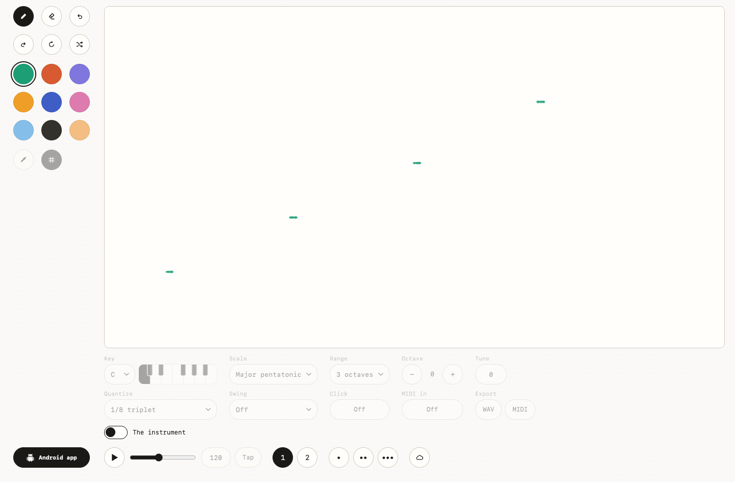
A mark is not only placed at a moment; its width can occupy part of the scan. Long horizontal gestures and tiny dots therefore create different kinds of events even at the same height.
For the next pass: Draw a short dot and a long horizontal stroke on the same pitch row with a gap between them. Shorten the long stroke while leaving its start position unchanged.
The playhead encounters a wider region for longer, so horizontal extent helps shape duration and continuity. Ask yourself: How does the second event's sustain or density change when its visible width shrinks?
This gets muddy when you start comparing strokes that also differ in height, color, and program. If that happens, use one color and one pitch row, then vary only the width of the second stroke.
A good second take is simple: Create three strokes that begin evenly but become progressively shorter. You should hear a repeated entrance pattern with contrasting event lengths. If the second take surprises you, keep it. A useful test can become a song idea.
Compose rhythm with marks and empty paper
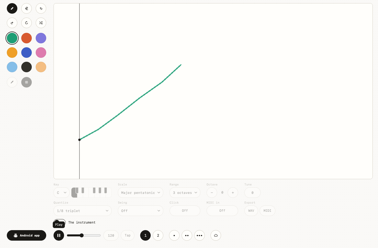
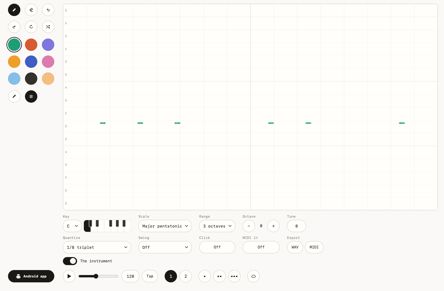
Silence is visible in this instrument. The empty distance between marks delays the next event, so a rhythm can be designed before any beat accompaniment is switched on.
Start small: Arrange six dots as two tight groups separated by a wide blank region. Move the second group closer without changing the spacing inside either group.
Rhythmic grouping depends on relative spacing: nearby events are heard together and wider intervals divide phrases. Ask yourself: When does the blank region stop feeling like a rest and start feeling like an ordinary gap?
Watch out for adding a beat before you can hear the rhythm already implied by the picture. If that happens, turn the beat and click off, slow the tempo, and listen to the marks alone.
If you are curious, try this: Make one group regular and the other intentionally uneven. The canvas should produce a steady fragment followed by a looser, more conversational answer. You may prefer the imperfect version. That is a choice, not a failed experiment.
Separate visual color from sonic character
Colors make overlapping musical roles readable. Because each color selects a voice, they can distinguish layers even when the shapes share time and pitch.
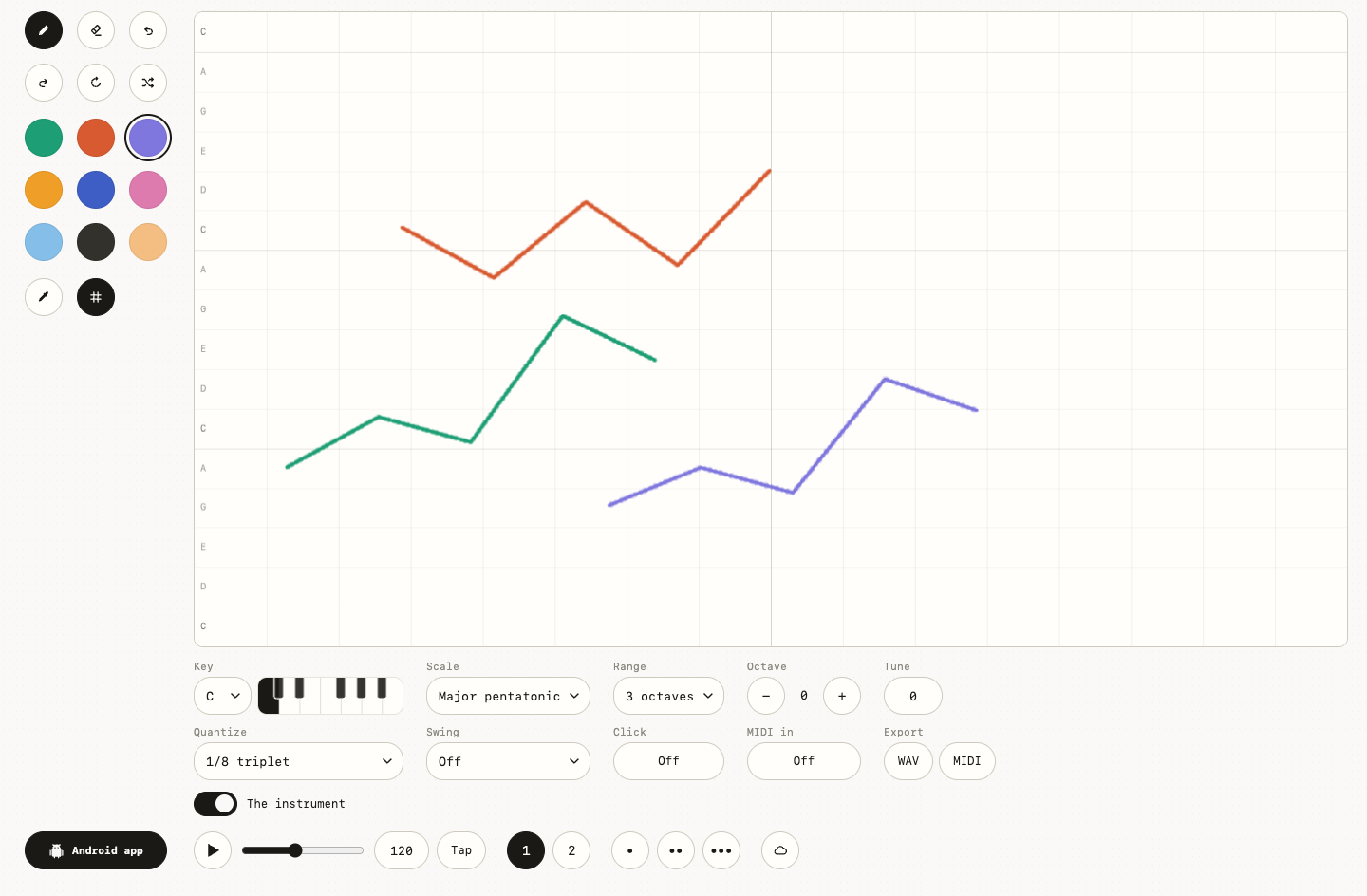
Here is the useful comparison: Draw the same short V shape in green, orange, and purple at three separate times. Place the orange and purple versions at the same horizontal position.
Timbre changes the texture of an event without requiring a new melodic contour. Ask yourself: Do the layered voices feel thicker, brighter, softer, or simply more crowded than the separated versions?
If the result is hard to read, you may be using so many colors that the ear cannot connect a voice to a visual layer. If that happens, mute the complexity by clearing the page and comparing only two strongly contrasting colors.
There is one more version worth hearing: Let one color repeat a pulse while another draws a slow curve over it. You should hear a foreground gesture supported by a more regular layer. The point is not to win the comparison; it is to notice what changed.
Use scale, range, tempo, and swing as lenses
The drawing supplies visible relationships, while the controls decide how those relationships are translated into a musical system. One picture can therefore support several coherent readings.
Before adding anything else: Make a simple zigzag and note its result in the default key, scale, range, tempo, and swing. Choose a different scale, then restore it and compare a different range.
Scale limits available pitches, range spreads the canvas across octaves, and tempo or swing changes temporal feel. Ask yourself: Which control changes the pitch collection, and which changes the distance covered by the same vertical movement?
The comparison stops being useful when you start changing every control and then describing the result as a property of the drawing alone. If that happens, restore defaults, take a reference pass, and change one selector between repeated plays.
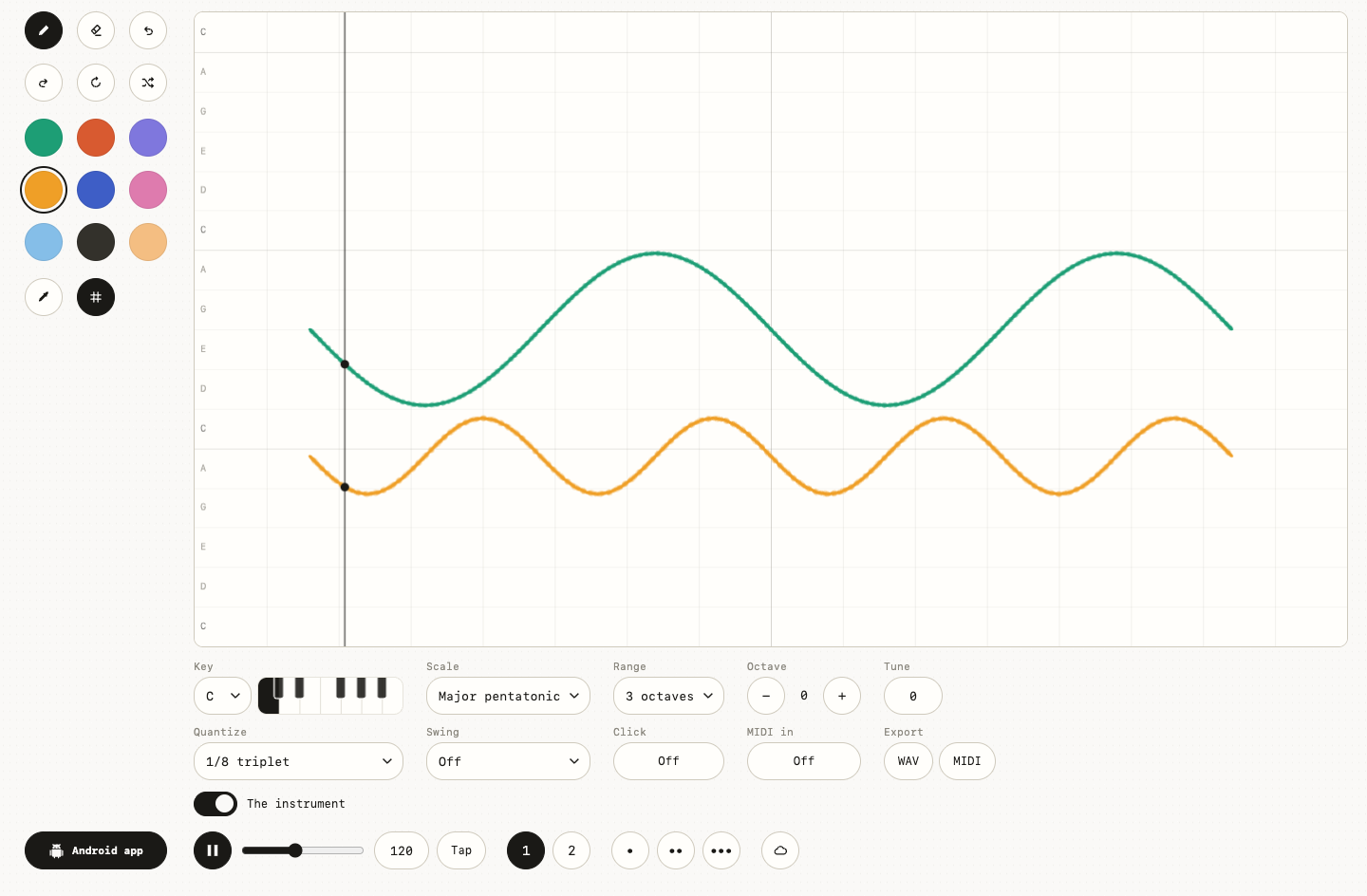
You can turn the test into a sketch: Use the grid and click to compare loose placement with beat-aligned placement. The contour should remain visually recognizable while its harmonic and rhythmic context changes. Save the odd result if it makes you want to listen again.
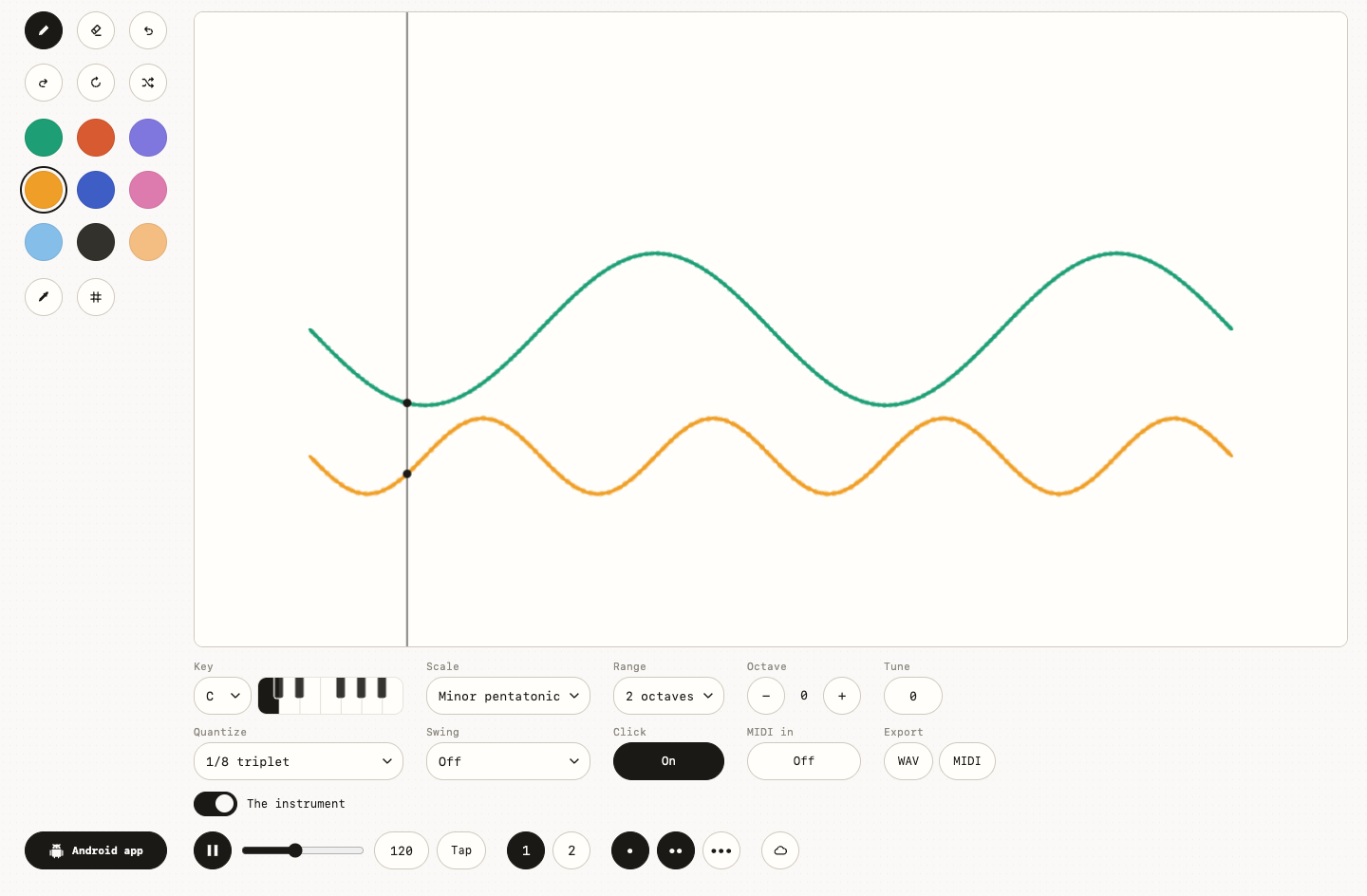
Predict a drawing before pressing Play
Prediction is the strongest test of whether the mapping makes sense. A useful visual analysis names likely pitch direction, timing groups, voices, and rests before sound confirms or challenges it.
For the last pass: Use Shuffle to create a fresh composition and pause before playback. Write four predictions about height, spacing, color, and the final empty region.
Prediction joins visual evidence to musical expectation and exposes assumptions that passive listening can hide. Ask yourself: Which prediction was accurate, and which setting or mark explains the surprise?
The last thing to avoid is calling every unexpected sound random instead of checking the active controls. If that happens, inspect the palette, scale, range, program, beat, and tempo, then replay one visual group at a time.
Then stop reading and try one final variation: Rearrange one group to make a previously wrong prediction become true. You should be able to explain the revised loop from visible cause to audible effect. You have enough information now. Close the guide and make the next choice by ear.
Wiggly Music app
Keep making music on Android.
Take the idea with you in Wiggly Music.